A typical household in America receives about 454 pieces of mail per year, but very few are actually looked at before being tossed into the trash can. Postcards are an old-school form of direct mail that works well, but they, too, come with their disadvantages. A poorly-designed postcard is thrown away faster than anything else. Still, an effective postcard will not only receive a second glance but also be put up on a bulletin board or left sitting around on a kitchen counter for days on end. Rarely is this due to the budget, but rather the message being sent out.
No matter whether you’re a local business owner sending out a card or a marketing professional who runs a nationwide direct mail campaign, certain rules apply to all postcards. Whether you want your postcard to be used by your customers, you will need to ensure that all the components mentioned above work seamlessly together. Otherwise, the entire postcard will be a waste of time and money, serving neither its marketing nor its printing purposes.
With this in mind, read on to discover 5 tips for sending postcards that stand out from the rest.
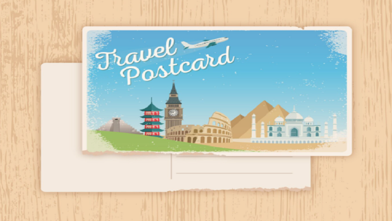
1. Lead With a Visual That Does the Heavy Lifting
You only get one chance to make a good first impression on the front of your postcard, and you have about two seconds to do it. Strong images do this job much better than words. Pick one strong picture that gets your point across without using any words. The picture isn’t doing its job if someone has to read the card to figure out what it’s about.
Consider contrast. A high-resolution picture or design set against a blank backdrop will grab the viewer’s attention much better than a chaotic design with multiple components vying for it. Don’t forget about negative space. This isn’t wasted space at all – it’s a space that provides a break for the eye.
If you want to take this further, think about a format that isn’t just static printing. A lenticular cardhas a ribbed lens that makes the image appear to move or change depth as the viewer tilts it. Enduraline says that lenticular postcards are up to ten times more likely to be noticed than regular direct mail and that people are much more likely to keep them after reading them for the first time. It is worth a lot of thought for campaigns where people need to remember them.
2. Write a Headline That Earns the Rest of the Read
Your headline carries the same weight as your visual. It should be short, specific, and immediately useful to the reader. Avoid clever wordplay that makes people work to understand it. The goal is clarity first, then personality.
A strong postcard headline addresses what the recipient gains, not what you do. “Save 20% On Your Next Order” works better than “We Have Great Deals.” “Book Your Appointment Before Spots Fill Up” works better than “Call Us Today.” The reader should know within a single glance exactly what the card is offering them.
Keep the headline large enough to read without squinting, and never crowd it with subheadings, taglines, or secondary copy fighting for the same visual lane. One message per postcard is the rule. Every additional message you try to add dilutes the one that matters.
3. Personalize Beyond Just the Name
According to research in the direct mail industry, adding the recipient’s first name to a direct mail piece can boost response rates by as much as 135%. But real personalization is more than just a mail-merge name field.
Before you print anything, divide your mailing list into groups. A postcard sent to a loyal customer who has bought from you before should sound different than one sent to someone who hasn’t bought from you before. Depending on what you know about the person you’re sending the message to, the offer, tone, and even the pictures can change. A customer who has bought from you before wants to feel important. You need to give a new prospect a reason to trust you.
If your list lets it, mention something specific, like the customer’s city, a type of item they bought in the past, or a seasonal event that is important to them. People are more likely to respond to a postcard that seems like it was written just for them instead of for ten thousand other people.
4. Make the Call to Action Impossible to Miss
A postcard without a clear call to action is just a photograph with your address on it. Every card you send needs to tell the recipient exactly what to do next, and make that action easy to take.
Your call to action should appear on its own line, in a font size that stands apart from the rest of the body copy. Use an action verb: “Visit,” “Call,” “Scan,” “Claim.” Give a deadline if you have one; urgency consistently improves response rates. And limit yourself to one call to action per card. Asking someone to call, visit the website, and follow you on social media all at once guarantees they will do none of the above.
QR codes have made bridging print and digital far simpler. A well-placed QR code that links to a specific landing page lets you track conversions directly from the postcard campaign. Research from Postalytics shows that coordinating direct mail with digital channels increases response rates by 63 percent and website visits by 68 percent, making the combination well worth the extra step.
5. Get the Format and Finish Right Before You Print
Size matters more than most senders realize. Oversized postcards consistently outperform standard-sized ones in response rate benchmarks. A larger card commands more real estate in the mailbox and feels more substantial in hand. If your budget allows, going slightly bigger than the standard 4×6 format is often worth the added cost per piece.
Paper stock and finish also affect how recipients perceive the card and the brand behind it. A thick, coated stock with a matte or soft-touch finish signals quality. Thin, flimsy cardstock signals the opposite, regardless of how good your design is. The tactile experience of handling a postcard is part of the message.
Beyond standard print finishes, specialty options like spot UV coating, foil accents, or lenticular effects add a sensory dimension that flat printing cannot replicate. These finishes cost more, but they dramatically extend how long a card stays in someone’s possession. A postcard that sits on a desk for a week delivers far more impressions than one that goes straight into the bin.
Conclusion
Postcards have outlasted dozens of marketing trends because they work. A physical card in someone’s hand cannot be filtered into a spam folder, blocked by an algorithm, or dismissed with a single tap. But the mailbox is still a competitive space, and a postcard that looks like every other piece of mail is invisible.
The tips above are not about spending more. They are about thinking more carefully before you print. A sharper image, a tighter headline, a smarter list segment, a single, clear call to action, and a format built for its strengths: these are the decisions that separate postcards that get results from those that get recycled. Start applying them one at a time, and the improvement in response will be noticeable faster than you expect.